Visual Studio 2010 provides a solid WPF-editing experience; and, if you so choose, you can use the IDE for all of your XAML editing. However, for complex applications, your work load will often decrease considerably if you use Blend to generate the markup, and then open the same project in Visual Studio to tweak the markup (if needed) and author code.
On a related node, Blend 3.0 ships with a simple code editor; while it is not anywhere near as powerful as Visual Studio, you can use this built-in C# editor to add code quickly to the UI event handlers during development.
To begin learning about Blend, load the product and click the New Project button from the Welcome dialog (if you don’t see the dialog, you can activate it from the File > New project menu command). In the New Project dialog (see Figure 28-17), create a new WPF Application named WpfControlsAndAPIs.
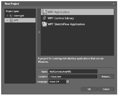
Figure 28-17 Creating a new WPF Application with Expression Blend
Once you open the project, activate the Projects tab mounted on the upper-left area of the IDE (if you don’t see it, activate the Window > Projects menu option). As you can see in Figure 28-18, a WPF Application generated with Blend is identical to a WPF project generated with Visual Studio.
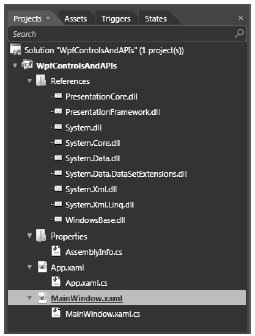
Figure 28-18 An Expression Blend WPF project is identical to a Visual Studio WPF project
Now locate the Properties tab on the right-hand side of the Blend IDE. Similar to Visual Studio 2010, this aspect of the tool allows you to assign property values to an item selected on the designer. However, it looks quite different from its Visual Studio 2010 counterpart. For example, notice that similar properties are grouped together in collapsible panes (see Figure 28-19).
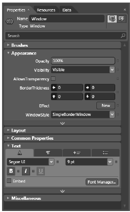
Figure 28-19 The Blend Properties editor
Perhaps the most obvious part of the Blend IDE is its window designer, which takes up a majority of the real estate. Notice that you can see three small buttons in the upper-right area of the window designer; these buttons allow you to open the designer itself, the underlying XAML, or a split view. Figure 28-20 shows the designer in split view.
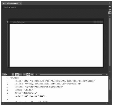
Figure 28-20 The Blend Designer allows you to view the underlying XAML
The XAML editor is quite feature-rich. For example, as you start typing, you will activate IntelliSense and find support for auto completion, as well as a useful help system. You won’t have to enter much XAML manually in this example, but you can see the editor at work in Figure 28-21.
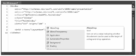
Figure 28-21 The Blend XAML editor is as rich as the editor in Visual Studio
Another key aspect of Blend to be aware of is the Objects and Timeline area (located in the bottomleft area of the Blend window). As you will learn in Chapter 30, the timeline aspect of this tool allows you to capture animation sequences. For now, suffice it to say that this aspect of the IDE allows you to view the logical tree of markup, much as the Document Viewer in Visual Studio 2010 does. Currently, your Objects and Timeline window should look like what you see in Figure 28-22.
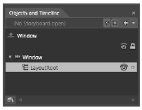
Figure 28-22 You can view the tree of XAML using the Objects and Timeline editor
Here, you can see that your top-most node is the Window itself, which has an item named LayoutRoot as content. If you view the XAML of your initial window, you see this is the name given to the default <Grid> layout manager:
<Window
    xmlns="http://schemas.microsoft.com/winfx/2006/xaml/presentation"
    xmlns:x="http://schemas.microsoft.com/winfx/2006/xaml"
    x:Class="WpfControlsAndAPIs.MainWindow"
    x:Name="Window"
    Title="MainWindow"
    Width="559" Height="288" >
    <Grid x:Name="LayoutRoot"/>
</Window>
If you do not want to use a Grid as your default layout manager, you can edit the XAML file directly. Or, if you prefer, you can right-click the LayoutRoot icon in the Objects and Timeline window and select the Change Layout Type menu option.
Note When you wish to use the Properties editor to change the look-and-feel of a UI item, select it from the Objects and Timeline tree first. This will automatically select the correct item on the designer.
One final key aspect of Blend you should know about for now is the Tools editor, mounted on the far-left side of the IDE. Here you will find an assortment of WPF controls to select and place on your designer. Figure 28-23 shows that some of these buttons have a small triangle in the bottom-right area. If you click and hold such buttons, you will find a selection of related choices.
Note I have my Tools window mounted at the top of the Blend IDE, so my controls appear in a horizontal, rather than vertical strip. You can dock almost any Blend window using a standard mouse drag-and-drop command. Also, the Window > Reset Current Workspace menu option automatically restores the default location of each Blend window.
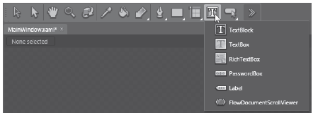
Figure 28-23 The Tools editor allows you to select a WPF control to place on the designer
Also notice that one of the buttons on the Tools window looks like a double greater-than sign (>>). Clicking this button opens up the Assets Library (see Figure 28-24). Here you will find many additional WPF controls that don’t appear on the Tools window by default. Selecting items from the Assets Library moves them into the Tools area for use.
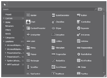
Figure 28-24 The Assets Library gives you access to additional WPF controls
Another important topic related to the Tools window is a common point of confusion for people who work with Blend for the first time; specifically, people are often confused about the difference between the Selection and Direct Selection buttons.
When you want to select an item on the designer (such as a Button) to change its size or relocate it in the container, you do so using the Selection button, which is the black arrow button (see Figure 28-25).
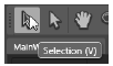
Figure 28-25 A Selection allows you to resize and reposition content on the designer
You use the Direct Selection arrow button (white in color) to drill into the content of a content control. Thus, if you direct select a Button, you can drill into its interior to build complex content visually (e.g., add a StackPanel and graphical items). You will revisit direct selection in Chapter 31 when you look at building custom controls. For this chapter, make sure you choose Select items, rather than Direct Select, when you build your GUIs.
Your window will contain a TabControl with four different tabs, each of which shows off a set of related controls and/or WPF APIs. Begin by ensuring that LayoutRoot is the selected node in your Objects and Timeline editor; this ensures that the control will be added to the panel. Next, use the Assets Library (the >> button) to locate the TabControl control. Now select the new item on your Tools window and draw the control onto the window designer so it takes up the majority of the surface. You should now see a tab system on your window with two default tabs.
Select your new TabControl in the Objects and Timeline editor, and then use the Properties window to name your new control myTabSystem using the Name edit area at the top of the property editor. Next, right-click the TabControl in the Objects and Timeline editor and select Add TabItem (see Figure 28-26).
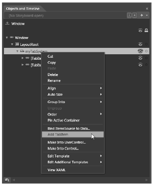
Figure 28-26 Visually adding TabItems
Add another tab to your control and use the Properties editor to locate the Common Properties area of the Properties window. Next, change the Header property for each tab, naming them Ink API, Documents, Data Binding, and DataGrid (see Figure 28-27).
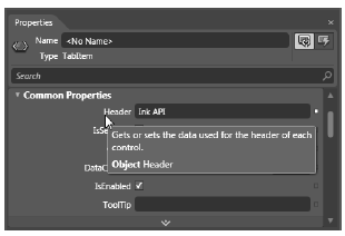
Figure 28-27 Visually editing the TabItem controls
At this point, your window designer should look like what you see in Figure 28-28.
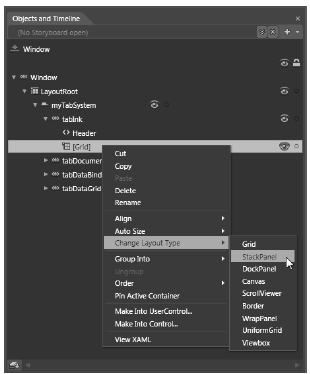
Figure 28-28 The initial layout of the tab system
Now click each tab again and use the Properties window to give each tab a unique, proper name (you can also select each tab item using the Objects and Timeline editor). Be aware that when you click a tab using either approach, that tab becomes the active tab, and you can design that tab by dragging controls from the Tools area. Before you begin to design each tab, take a peek at the XAML that the IDE generates on your behalf by clicking the XAML button. You should see markup similar to the following (your markup might differ based on the properties you set):
<Window
    xmlns="http://schemas.microsoft.com/winfx/2006/xaml/presentation"
    xmlns:x="http://schemas.microsoft.com/winfx/2006/xaml"
    x:Class="WpfControlsAndAPIs.MainWindow"
    x:Name="Window"
    Title="MainWindow"
    Width="628" Height="383" >

    <Grid x:Name="LayoutRoot">
        <TabControl x:Name="myTabSystem" Margin="8">
            <TabItem x:Name="tabInk" Header="Ink API">
                <Grid/>
            </TabItem>
            <TabItem x:Name="tabDocuments" Header="Documents">
                <Grid/>
            </TabItem>
            <TabItem x:Name="tabDataBinding" Header="Data Binding">
                <Grid/>
            </TabItem>
            <TabItem x:Name="tabDataGrid" Header="DataGrid">
                <Grid/>
            </TabItem>
        </TabControl>
    </Grid>
</Window>